" height="6.47336176808001px" id="GJ0PqD9AX" transform="translate(1 1)" width="41.00000121338849px"/></svg>)
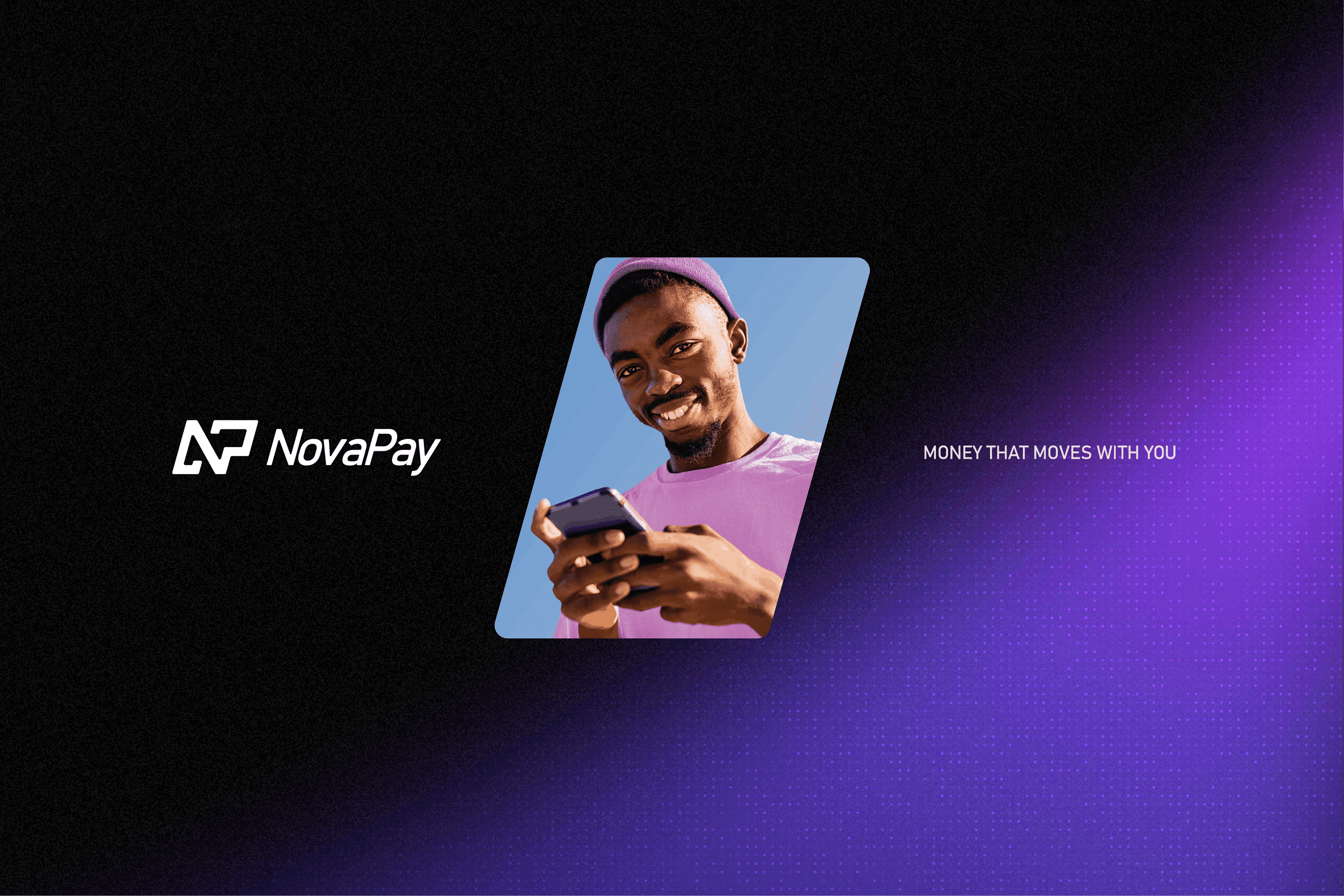
NovaPay is a self-initiated identity for a fictional fintech startup — a simple, secure, fast peer-to-peer payment app, Venmo meets Revolut, built around one focus: international transfers. The brand needed to feel innovative, trustworthy, friendly, and fast — four words that shaped every decision that followed.
Challenge & Approach
Cross-border payments still carry friction people shouldn't have to think about — conversion rates, fees, apps that feel like banking instead of communicating. NovaPay's premise: make sending money abroad feel as easy as sending a text, for an audience that's mobile-first and always moving — young professionals, freelancers, and digital nomads who send money abroad to family, friends, and clients.
I started with moodboards and a handful of hand-drawn logo directions, posted them for outside feedback, and built the rest of the system around the version that landed best.


Branding & Visual Direction
The mark is built from N and P, drawn as a diagonal path from one point to another — money moving from A to B, the same motion as a message sent and received. That diagonal carries through the type and layout, so the brand always feels mid-motion rather than static.
Purple brings the innovation and freshness; black brings a premium touch. Together they pull NovaPay out of fintech's usual blue, while "Money that moves with you" ties it back to the idea that your money should follow you, wherever you're working or traveling.

What I Built
Brand Guideline Typography, icon set, and usage rules to keep the identity consistent everywhere it shows up.
App Icon The NP mark tested as a home-screen icon — legible and recognizable at a glance.
Business Card A print touchpoint, to see the identity hold up off-screen.
Website — Desktop & Mobile Both breakpoints built together so the motion language reads the same on any device.
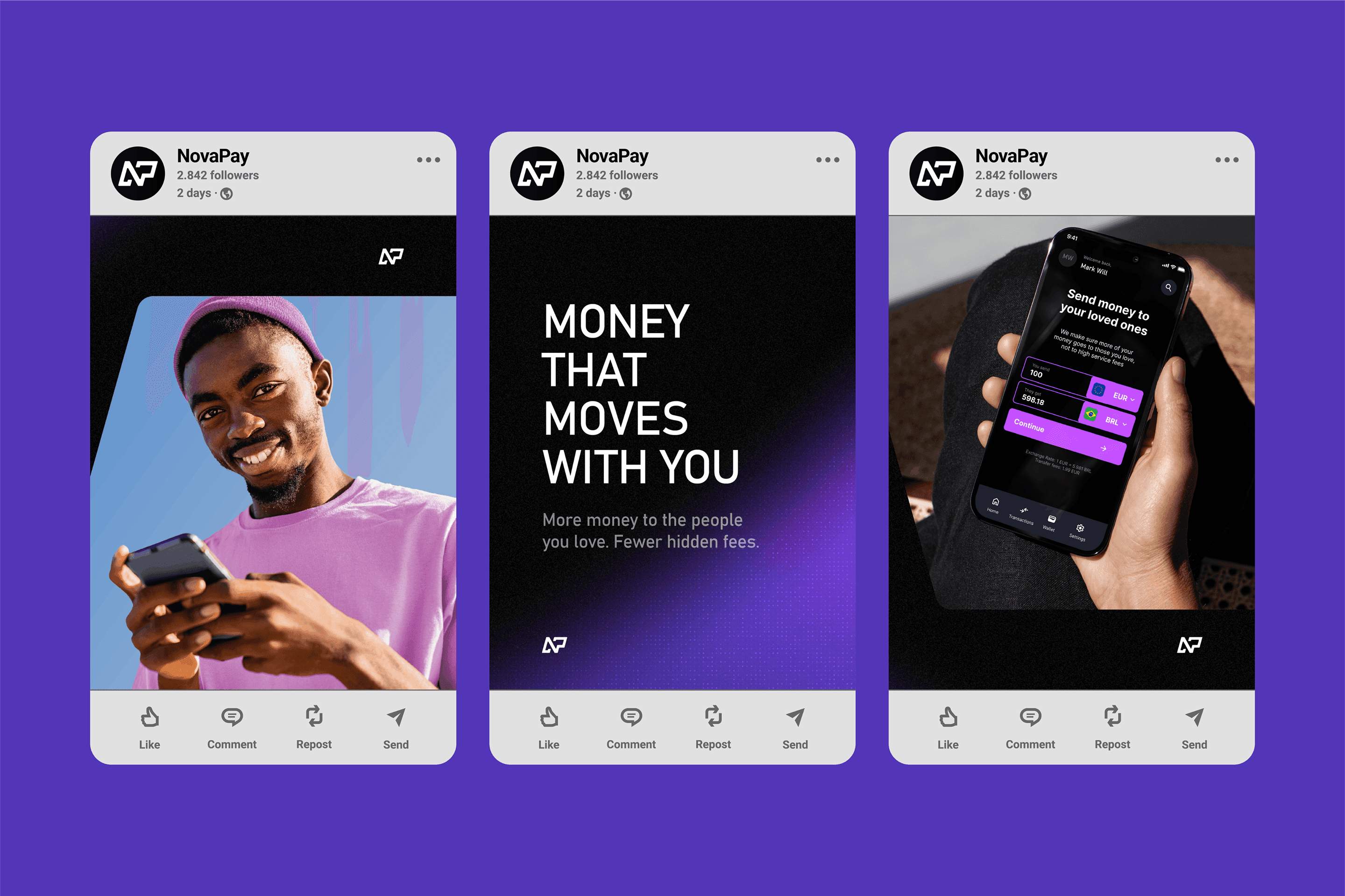
Advertising Campaign Ads designed to test the brand as something that could exist in the real market, not just on a logo sheet.
Social Templates Post formats carrying the same diagonal shapes and type, giving the brand a voice for launch-style content.

Outcome
There's no product behind NovaPay, so there are no numbers to report — that's not what this project was for. What it did deliver was a full system built from one hand-drawn mark: identity, product, advertising, and social, all pulling in the same direction.
It was a chance to set the brief myself and follow it all the way through — proof of a point of view, and a reminder of how the process feels without a client steering the outcome.